Search

Super Library Marketing: Practical Tips and Ideas for Library Promotion

Tag

library infographics

10 New Infographic Ideas To Prove the Value and Power of Your Library

Photo courtesy Cincinnati and Hamilton County Public Library

I was scrolling through LinkedIn when a post by a librarian named Kaitlyn Carpenter, who works at a high school in Houston, Texas caught my attention. She said:

“One of my favorite things that Houston Independent School District library services implemented this year has been our monthly infographics! I love digging into data and understanding trends in my library like:

  • Wednesdays are always our busiest days.
  • Ninth and 10th graders are often the most likely to visit the library.
  • Comparing how circulation fluctuates throughout the school year.”

“Infographics like these allow libraries to market to their school and district to show impact! I have made it a part of my practice to include marketing images and graphics in every weekly eNews that goes out.”

Kaitlyn knows the power of infographics

The content management company Marq.com has compiled a ton of research on the value of infographics. Among their findings:

  • About 90 percent of the information transmitted to the brain is visual. Infographics are a perfect way to turn static, boring information into visuals. And that’s important because…
  • People remember 65 percent of information when it’s paired with an image. In contrast, they remember just 10 percent when they hear it or read it without an image.

Most libraries use infographics to share statistics, like summer reading participation and impact. But your library can use an infographic to demonstrate much more than numbers!

10 innovative ways to use infographics in your library marketing

Storytelling

Use infographics to tell a story about a patron’s journey and how the library affected their life. The visuals can depict all portions of the story.

You can introduce your patron as a main character. Show the problem they face. Illustrate the solution available at the library. And then end with graphics that show how your patron’s life was impacted by their interaction with the library.

Explain Your Strategic Plan

An infographic is an engaging way to easily explain the complex information contained in most library strategic plans.

You’ll want to start with an overview of your mission and vision, followed by specific goals and the steps to achieve them. Use graphics to demonstrate the timeline for the planned work.

Here’s a great example from the Winnipeg Public Library and another from my former employer, The Public Library of Cincinnati and Hamilton County. When I worked at the library, we used this infographic to explain the strategic pillars to staff and to the public.

Testimonials and Quotes

Want to share powerful quotes about the importance of a library program or service? Include testimonials from patrons and community members in your infographic. This adds some humanity to the data.
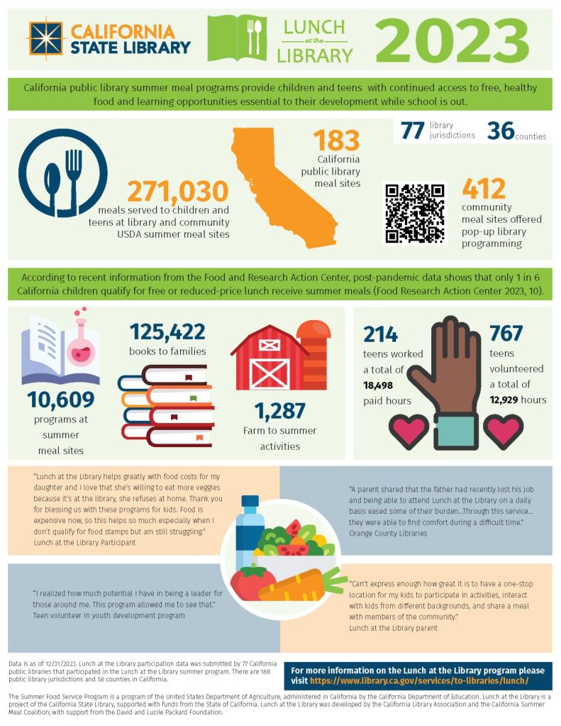
California State Library added testimonials to their infographic explaining the impact of free lunch services.

Tutorials

We know some community members have difficulty using library resources like databases or vendor apps. (Remember how many people struggled with the Libby App?) Some members of the public may find long, text-based tutorials to be to complex.

You can turn those text instructions into a visual how-to guide to help community members ingest the information. Here’s a fun, two-page infographic from Falvey Library at Villanova University. It explains everything a student needs to know about the library as they start a new school year.

Compare and Contrast

Instead of just sharing statistics, use an infographic to compare metrics before and after library interventions. The visuals go a long way to clearly illustrating the impact of your library work.

You can also use an infographic to explain why library services are superior to other resources.

Arkansas River Valley Library System’s infographic shows the free library services that can replace paid subscription services.

Service Bundles 

Create a flowchart showing how a patron uses multiple services.

For example, your patrons may start by visiting your library’s website, where they sign up for a cooking program. When they get to the branch to attend the program, they may pick up a cookbook from a book display. Inside the cookbook, they may find a bookmark promoting the library of things.

An infographic illustration of that patron journey helps explain the interconnectedness of library services to board members, lawmakers, and potential partners.

Delray Beach Public Library explains the interconnectedness of its services in this infographic.

Visualizing Partnerships

Use an infographic to show how the library collaborates with other local organizations, schools, and businesses. This will demonstrate how the library actively engages with the community, which builds trust and awareness. It can also highlight additional services and programs available through these partnerships.

Here’s a great example from the Tampa Bay Library Consortium explaining how the Institute of Museum and Library Services Funds help Florida library programs.

Library Accessibility

Your library can use an infographic to illustrate how the library makes resources accessible to different demographics. This includes children, seniors, and non-English speakers.

For example, if your library knows that 95 percent of seniors who attend tech skills programs learn to use tech fluently, you can demonstrate that with graphics.

Bonus tip: For accessibility of your infographic, create a downloadable alt-text document for the infographic. This allows people who use screen readers to consume the infographic. Here’s an example from EBSCO. Scroll to the bottom of the illustration and you’ll see the prompt to download the alt-text version of this infographic.

Environmental Impact

Show the library’s efforts in sustainability and green initiatives. Use visuals to demonstrate eco-friendly programs, such as recycling, energy-saving measures, and community gardening projects.

If your library has undergone a renovation or built a new building and you’re Leed-certified, use an infographic to show your community how that designation saves money and the planet.

Volunteer Contributions

Infographics easily explain the impact of volunteers on a library. The visuals can help you clearly show the number of volunteer hours. They also illustrate the types of activities volunteers assist with. Additionally, they convey the value volunteers add to the library.

Need help creating your infographic?

I am not an artist. I can barely draw stick figures. So creating an infographic is daunting to me. This post explains the process I use to plan and create an infographic.

Hey library marketing friends: I’m teaching a pre-conference workshop at LMCC this year with my amazing coworker Caleigh Haworth. It’s all about marketing your collection. Registration is open now.


P.S. You might also find this helpful

The Top 13 Places To Find Library Content To Share When You’re Tired and Overworked (Bookmark This Post!)

Subscribe to this blog and you’ll receive an email whenever I post. To do that, enter your email address and click on the “Follow” button in the lower left-hand corner of the page. You can also follow me on the following social media platforms:
Show, Don’t Tell: Why Infographics are an Essential Component in Your Library Marketing

Infographics are visual marketing pieces that help explain facts and figures or lay out a complex set of information in a way that is easy to understand. They’re an incredibly effective marketing tactic.

Until recently, I thought infographics were a relatively new marketing tactic. I remember deciding in 2013 to create an infographic, the first for my library, to promote a readalikes list. I thought I was so innovative!

Turns out, infographics have been around for hundreds of years. Fun fact: The first known instance of infographics as we know them today dates to the late 1700s with a chart of wheat process and labor wages.

Frankly, I love infographics. They appeal to my visual and creative nature. They work well on social media. But they take a lot of time and planning. So, for libraries with a limited marketing staff, it can seem daunting to create one. But it’s worth it.

Why use infographics in library marketing?

Infographics grab attention. Our brains are hard wired for visuals. The human eye can process 36,000 visual messages per hour. That’s 60,000 times faster than the brain can process text. 60,000 times. Whoa.

A good infographic will trigger a reaction in the human brain, sometimes even before the person consciously realizes and processes that reaction.

Think about what happens to you when you see a photograph of a beloved family member or friend. The photo instantly makes you cry, laugh, or long for that person to return to your life. An infographic can trigger the same kind of emotional response. And emotional responses are the best kind of marketing, because they are memorable.

Infographics can explain complex ideas and convey a lot of information in a simple way that is accessible to many audiences. Libraries deal with a lot of data. Our products and services are sometimes difficult to break down into steps. A good infographic will take facts and figures, difficult instructions, or confusing concepts and present them in a way that everyone can understand.

Infographics will position your library as an expert in a way that words can’t. A good visual will demonstrate your library’s subject-matter expertise. It can boost your credibility. It shows that you care about effective communication with your community. And that builds trust with your visitors, community members, and stakeholders in a way that feels more genuine that fancy words.

Three ways to use infographics in your library marketing

Promote your collection. Use infographics to promote a themed collection series, such as new dystopian fiction, the best book club reads, or mystery authors.

You can recruit your collection development department to come up with a list or, if your library is a NoveList client, you can use the NoveList database to find books within a theme. Use the infographic to drive traffic to those titles in your catalog. This works really well on social media.

Explain difficult information. Create an infographic to help you explain something to your cardholders, like how to download an eBook, how to pay a fine, how your library uses taxpayer funding, or why summer reading is vital to childhood literacy.

Infographic template from LibraryAware

Show that your library is fun! Have your content team come up with a great idea for a fun promotion, like 20 signs that you might be a bookworm or how to make a bookmark out of an old book.

How to design a library marketing infographic

Create an outline. An outline can help you to lay out the pieces of the infographic and cut your ideas down to the essential elements.

Decide which points are essential for getting your message across. Is there a story to be told in the data or concept you are trying to convey? Is there a beginning, a middle, and an end to that story?

Once your outline is set, your other design elements will become clear to you. What is your theme? Will you use charts or graphics, lists or numbered elements, photos, shapes, or icons? Write those decisions down next to each section in the outline to help you organize your thoughts.

Plan your layout. You’ll want to make sure all the elements of your infographic are balanced. But that doesn’t mean everything has to be symmetrical!

For instance, if your infographic is explaining something that has a lot of considerations at the beginning of the process and works toward one end result, you could consider a funnel-design: making the number of visuals heavy at the top and lighter as the eye moves down.

If you are explaining something on a timeline, you can arrange your elements evenly from top to bottom but not directly across from one another.

It’s good to sketch your layout out before you go into a design program. This saves time in the actual process of creation and gives you space to make changes at a stage where it’s easy to fix.

You will also want to plan out any places in your infographic where you might need a visual break, like a solid block of color or a line or shape. Finally, be sure to leave white space. You want your infographic to look uncluttered.

Decide your color scheme. A good rule of thumb is to design your infographic with two or three main colors. Then choose a few minor color accents.

The subject of your infographic will have a bearing on your color decision. Some colors work better for explaining data, and some work better for explaining processes.

Infographic template in LibraryAware

Take your branding into consideration when you decide on your color scheme, to avoid clashing with your logo.

Pick your fonts. You’ll want to make sure your type is accessible to all audiences. Avoid script-type fonts. Keep in mind that an infographic is visual, and the amount of text will be minimal, so the font you choose must compliment the design elements of the infographics.

Limit your use of fonts to just two or three types. It’s good design to pick a font for the header, one for the main body text, and a third for the complimentary or subtext.

Write a headline that hooks your target audience. As you would with emails or blog articles, the headline or title of your infographic will need to convey the general theme of your visual and catch the attention of your potential audience. Be descriptive and catchy. The title should be shorter than a headline you may use for other content—only a few words long.

Subscribe to this blog and you’ll receive an email every time I post. To do that, click on the “Follow” button in the bottom left-hand corner of the page. Connect with me on YouTube, Twitter, Instagram, and LinkedIn.  

A WordPress.com Website.

Up ↑